Judging a Book by Its Cover
The academic publishing process is deliberate and measured. So I am delighted to finally reach the design stage, and I’m very excited to share some ideas with my publisher, University of Tennessee Press. Below, you’ll find some thoughts about the cover for my book. They are concepts offered in words and photos. I thought it would be fun to let all of you in on the process.
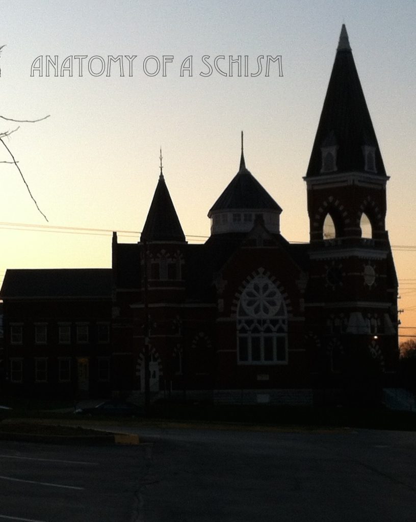
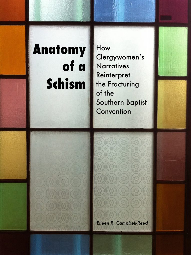
Each woman’s story in Anatomy of a Schism provides a window into the wider world of Baptists and the struggles that animated the split in the SBC of the 1980s and 1990s. It is also a story about churches and the changes they experienced through the schism. A church building with its doors and windows lets light and stories through in both directions. I have photographed and collected a number of images of churches and church windows in my travels over the last five years.
The stained glass ceiling has also become a major symbol of the barriers to women in ministry that remain. Yet actual stained glass ceilings are rare – especially in Baptist churches. The more common reality of windows, some clear and some stained glass, captures the image of church life, change over time, and the beauty of the lives caught up in those stories.
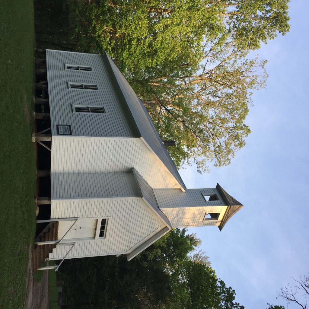
CADES COVE MISSIONARY BAPTIST CHURCH I
I like the way light and shadows of the trees plays on this sunset picture. The door was like then when we drove up… somehow one open and one shut says something significant that the book also tried to say: doors for baptist women were nearly always both open and shut.
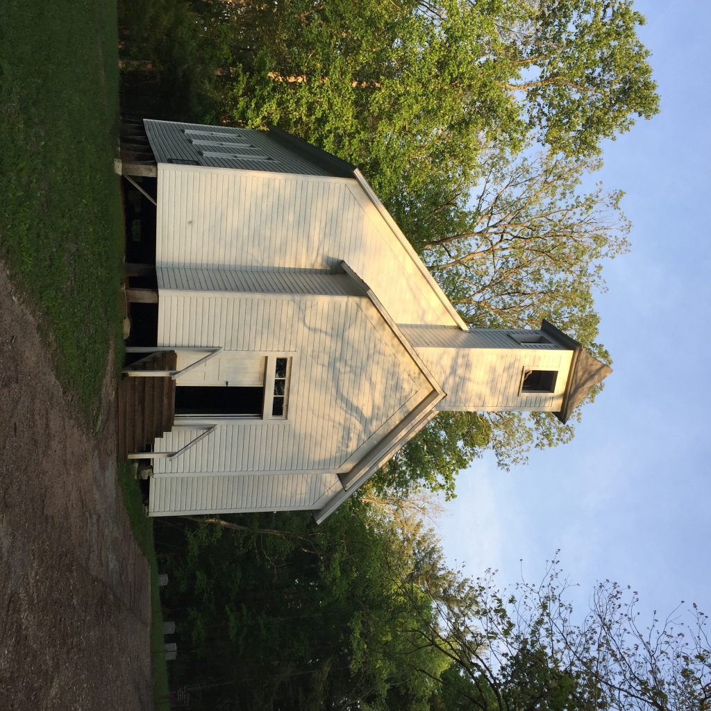
CADES COVE MISSIONARY BAPTIST CHURCH II
This angle captures more of the bones of the church and less of the sunlight and shadow on the steeple. However, I like the upward feel of dark that moves up toward light.
CHAPEL AT FBC GREENVILLE
This picture – which I first used for a six-word story – brings the light, shadow, color and stories of stained glass more fully into relief. The complexity of elements gets at the beauty and attraction of the stories, as well as the interpretive character of writing this kind of book, in which stories of individuals open out onto wider vistas of historical, theological and psychological understandings.
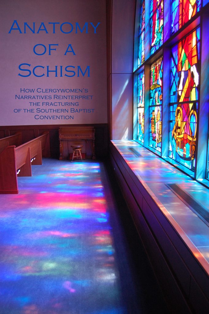
GEORGETOWN BAPTIST – SUNSET
This image is a bit more stark. The light of the sunset provides the contrast. It would have been really awesome if the rose window in the sanctuary had been lit from inside when I snapped this one!
ST. JOHN’S WINDOW
The concept in this picture puts the idea of stained glass also front and center, in a more stylized way. I don’t think I actually want a fractured piece of stained glass on the cover, but with the right one, perhaps.
What do you think? What do you like? I welcome your thoughts.

